BitDelta Wallet - Crypto Exchange Redesign
BitDelta Wallet - Crypto Exchange Redesign
BitDelta Wallet - Crypto Exchange Redesign
Web3, Blockchain, Mobile Application
BitDelta wallet prioritizes the safety of assets. It's leverage cutting-edge security measures to ensure crypto stays protected. Buy, sell, and trade crypto with ease. The intuitive interface makes navigating the market a smooth experience.

About BitDelta
BitDelta Wallet simplifies crypto for everyone—fast, secure, and easy to use. Whether you're a beginner or a pro, it bridges complex exchanges with everyday usability, helping you manage your digital assets with confidence and ease.
What Role Did I Play?
Role - Senior Product Designer
Skills - UX Strategy, UX Research, User Flows, Wireframing, Interaction Design, Visual Design, Rapid Prototyping
I led the end-to-end design of this product, working closely with the product manager and CTO as key stakeholders to ensure strategic alignment across positioning, experience, and visual direction.
Over an intensive three-month phase, I collaborated with a cross-functional team including a fellow designers, engineers, data analysts, and content writers to translate product goals into a cohesive and user-centric solution.

BitDelta Wallet - 2023 (Mar)
Problem Space
Stakeholders have pointed out that the current wallet for BitDelta app is facing challenges that are hindering user engagement and overall experience.
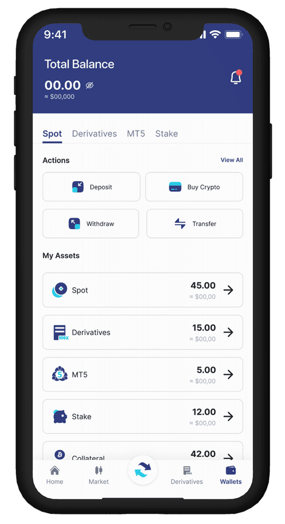
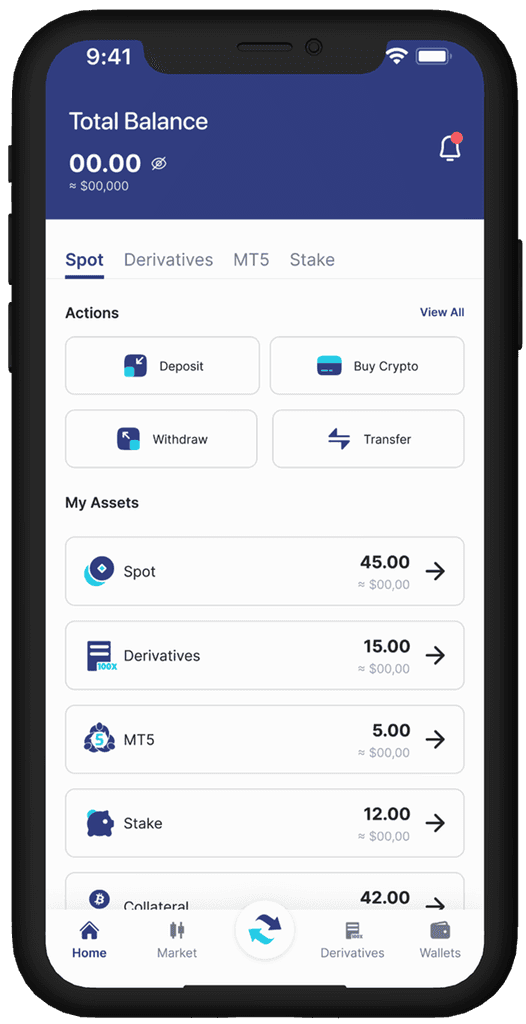
All wallet sections (Spot, Derivatives, MT5, Stake) are presented with equal weight, making it difficult for users to focus on what matters most — total balance and key actions.
Users have no immediate visual understanding of how their funds are allocated across wallets.
Only four actions are visible (Deposit, Buy Crypto, Withdraw, Transfer), with no clear path to additional features like OTC, Trading Bots, or Loan.
The absence of such a call-to-action may slow down onboarding or frustrate users who are ready to engage.
The current wallet experience is failing to attract new users. Complex interfaces, hidden costs, and advanced features alienate beginners, hindering mainstream adoption. This redesign project aims to create a user-friendly, transparent, and secure wallet section. By simplifying navigation, clarifying fees, and prioritizing basic functionalities, we will empower new users and build trust in the platform.
Key Insights From Potential Users
After conducting tests and engaging with users about the BitDelta crypto exchange wallet section, we have identified several key areas for improvement.
Lack of Clarity Between Wallet Types
Users often struggle to understand the purpose and difference between various wallet types. Terms like Spot, Funding, Margin, Earn, and Futures can be overwhelming.
No Unified View of Portfolio Performance
The app fails to provide a single, consolidated view of total asset balance across all wallets, including real-time performance tracking. Users must manually switch between wallets to calculate total worth
Overwhelming Interface for Beginners
The wallet interface presents all features upfront without contextual hierarchy, customization, or user segmentation.
Buried or Inaccessible Key Actions
Critical actions like Convert, Transfer, Deposit, and Withdraw are often hidden within menus or placed inconsistently across wallet sections.
Core Features
Core Features

Information Architecture & User Flow

Wireframes
Wireframes


Designing a simple and manageable experience
Designing a simple and manageable experience
Designing a simple and manageable experience
After many brainstorming sessions and iterations, we have developed a solution that perfectly aligns with our goals and design principles.

BitDelta Wallet - 2023 (July)
BitDelta Wallet - 2023 (July)
BitDelta Wallet simplifies crypto for everyone—fast, secure, and easy to use. Whether you're a beginner or a pro, it bridges complex exchanges with everyday usability, helping you manage your digital assets with confidence and ease.
About BitDelta
What Role Did I Play?
What Role Did I Play?
Role - Senior Product Designer
Skills - UX Strategy, UX Research, User Flows, Wireframing, Interaction Design, Visual Design, Rapid Prototyping
I led the end-to-end design of this product, working closely with the product manager and co-founders to ensure strategic alignment across positioning, experience, and visual direction.
Over an intensive three-month phase, I collaborated with a cross-functional team including a fellow designers, engineers, data analysts, and content writers to translate product goals into a cohesive and user-centric solution.
BitDelta Wallet - 2022
Problem Space
Stakeholders have pointed out that the current wallet for BitDelta app is facing challenges that are hindering user engagement and overall experience.
Wallets tend to show too much information: spot, margin, futures, earn, funding, etc., which creates clutter and cognitive overload.
With too many entry points (Deposit, Withdraw, Convert, Transfer, Earn, Trade) it's not clear where to go next.
A desktop first mindset resulted in overwhelming lists and non-mobile optimized layouts.
The current wallet experience is failing to attract new users. Complex interfaces, hidden costs, and advanced features alienate beginners, hindering mainstream adoption. This redesign project aims to create a user-friendly, transparent, and secure wallet section. By simplifying navigation, clarifying fees, and prioritizing basic functionalities, we will empower new users and build trust in the platform.
Key Insights From Potential Users
After conducting tests and engaging with users about the BitDelta crypto exchange wallet section, we have identified several key areas for improvement.
Lack of Clarity Between Wallet Types
Users often struggle to understand the purpose and difference between various wallet types. Terms like Spot, Funding, Margin, Earn, and Futures can be overwhelming.
No Unified View of Portfolio Performance
The app fails to provide a single, consolidated view of total asset balance across all wallets, including real-time performance tracking. Users must manually switch between wallets to calculate total worth
Overwhelming Interface for Beginners
The wallet interface presents all features upfront without contextual hierarchy, customization, or user segmentation.
Buried or Inaccessible Key Actions
Critical actions like Convert, Transfer, Deposit, and Withdraw are often hidden within menus or placed inconsistently across wallet sections.
BitDelta Wallet simplifies crypto for everyone—fast, secure, and easy to use. Whether you're a beginner or a pro, it bridges complex exchanges with everyday usability, helping you manage your digital assets with confidence and ease.
About BitDelta


Result & Impact
I conducted a moderated remote user test with five people to assess the usability of my prototype. Participants, ranging in age from 17 to 50, were asked to use the prototype to complete tasks and navigate its different sections. (crypto novices and power users)
Key Tasks
Navigate to Spot Wallet and check asset balance
Transfer assets between Spot and Funding wallets
View and filter transaction history
Withdraw crypto and review fees
Quantitative Metrics
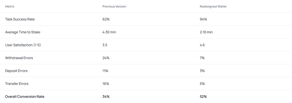
The updated cryptocurrency wallet app garnered mostly good response, with users praising the better interface and experience. However, there are other areas that may be improved, including navigation and language uniformity. Implementing the proposed adjustments may improve the user experience, particularly for beginners.
Next Steps
Update the app's navigation to make key functions more accessible.
Standardize throughout the program.
Increase the visibility of your buy crypto section.
After implementing modifications, conduct follow up usability testing to validate the improvements.
Enjoyed the case study? Check the other three out!
Enjoyed the case study? Check the other three out!
Enjoyed the case study? Check the other three out!


BitDelta Wallet - Crypto Exchange Redesign
Web3, Blockchain, Mobile Application
BitDelta wallet prioritizes the safety of assets. It's leverage cutting-edge security measures to ensure crypto stays protected. Buy, sell, and trade crypto with ease. The intuitive interface makes navigating the market a smooth experience.
BitDelta Wallet - 2022
Problem Space
Stakeholders have pointed out that the current wallet for BitDelta app is facing challenges that are hindering user engagement and overall experience.
Wallets tend to show too much information: spot, margin, futures, earn, funding, etc., which creates clutter and cognitive overload.
With too many entry points (Deposit, Withdraw, Convert, Transfer, Earn, Trade) it's not clear where to go next.
A desktop first mindset resulted in overwhelming lists and non-mobile optimized layouts.
The current wallet experience is failing to attract new users. Complex interfaces, hidden costs, and advanced features alienate beginners, hindering mainstream adoption. This redesign project aims to create a user-friendly, transparent, and secure wallet section. By simplifying navigation, clarifying fees, and prioritizing basic functionalities, we will empower new users and build trust in the platform.
What Role Did I Play?
Role - Senior Product Designer
Skills - UX Strategy, UX Research, User Flows, Wireframing, Interaction Design, Visual Design, Rapid Prototyping
I led the end-to-end design of this product, working closely with the product manager and co-founders to ensure strategic alignment across positioning, experience, and visual direction.
Over an intensive three-month phase, I collaborated with a cross-functional team including a fellow designers, engineers, data analysts, and content writers to translate product goals into a cohesive and user-centric solution.
Key Insights From Potential Users
After conducting tests and engaging with users about the BitDelta crypto exchange wallet section, we have identified several key areas for improvement.
Lack of Clarity Between Wallet Types
Users often struggle to understand the purpose and difference between various wallet types. Terms like Spot, Funding, Margin, Earn, and Futures can be overwhelming.
No Unified View of Portfolio Performance
The app fails to provide a single, consolidated view of total asset balance across all wallets, including real-time performance tracking.
Overwhelming Interface for Beginners
The wallet interface presents all features upfront without contextual hierarchy, customization, or user segmentation.
Buried or Inaccessible Key Actions
Critical actions like Convert, Transfer, Deposit, and Withdraw are often hidden within menus or placed inconsistently across wallet sections.
Core Features
Information Architecture & User Flow
Wireframes
Designing a simple and manageable experience
I designed the main flow with first-time users in mind, introducing them to the key features while having it feel simple and manageable. Adhering closely to a set of product constraints helped me set a focused approach: