Economy & Tourism, Design System
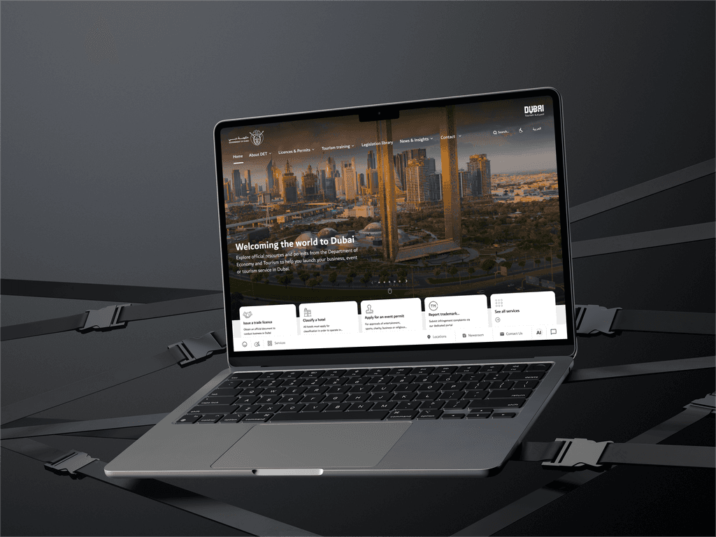
The Visit Dubai website, managed by the Department of Economy & Tourism (DET) of the UAE, serves as an official guide for visitors to explore Dubai's offerings. It is designed to provide comprehensive information, attract global tourists, and enhance Dubai's image as a world-class destination.
Visit Dubai, a premier tourism platform, helps millions of travelers explore Dubai’s attractions, experiences, and services.
About half of Visit Dubai platform users rely on search as their primary navigation tool. Our goal was to enhance the design system for consistency and scalability.
As we geared up to enhance Visit Dubai’s design system, our mission was not just functionality but also fixing usability issues and refining designs as needed.
As the sole designer, I led a cross-collaborative project to enhance the design system.
Collaborating with Product Managers and Senior Designers for product thinking and user-centric approaches.
I also worked closely with the BA Team, Product Analytics and Web Engineering to explore technical aspects. Guided by Head of Product and Head of Design, I delved into business backward thinking.
Each time we initiated a new project or entered a new phase, we found ourselves starting from scratch. This involved creating a new component library every time.
As a result, we ended up redesigning the same components repeatedly, with styles varying to match different functionalities. To address this, we needed to:
Rebuild existing components
Consolidate past use cases and define new use cases for each component
The Visit Dubai design system, originally built in Adobe XD, is outdated and lacks the necessary structure to support a growing digital platform. Without clear guidelines or reusable components, it leads to redundant work and poor collaboration across teams. Inconsistent visual elements and interfaces result in a fragmented user experience, making it difficult to maintain cohesion across devices and platforms.
Additionally, the current system doesn’t fully meet accessibility standards, limiting its inclusivity and user-friendliness. As the platform expands, the lack of scalability and responsiveness in the design system is becoming a barrier to progress. A redesign is essential to establish a unified, scalable system that improves collaboration, ensures consistency, and enhances the overall user experience.
The goal of re-shaping the Visit Dubai design system is to create a unified, scalable, and efficient framework that ensures consistency across all digital platforms. This will involve developing a structured library of reusable components, typography, color schemes, and UI patterns to maintain visual and functional uniformity on both web and mobile platforms. By streamlining collaboration between designers, developers, and product teams, we aim to establish clear design guidelines and documentation that facilitate alignment on design principles and improve communication.
The enhanced design system will focus on increasing design efficiency, reducing redundancy, and improving maintainability by standardizing components and layouts. In addition, the system will adhere to accessibility standards, ensuring an inclusive user experience. With these improvements, Visit Dubai will be more efficient, cohesive, and user-friendly, offering travelers and stakeholders a seamless digital experience.
Part 1
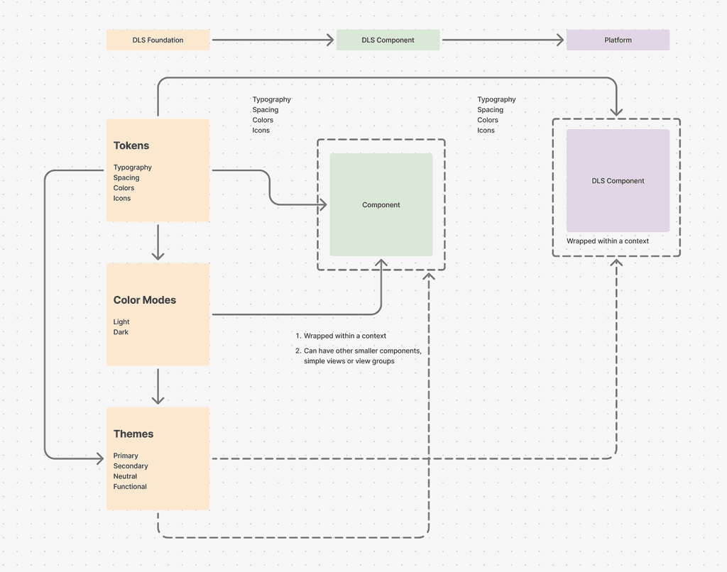
A Design Language System (DLS) is a collection of reusable design tokens, components, standards, and documentation. It allows design and development teams to reuse tokens and components, promoting consistency across platforms. The system also sets rules and principles for building components, guaranteeing a unified user experience. From a developer's perspective, these tokens and components are easy to integrate, simplifying the creation of new UIs and significantly reducing development effort and product release timelines.
Part 2
Part 1
This is the granular part of DLS. This consists of:
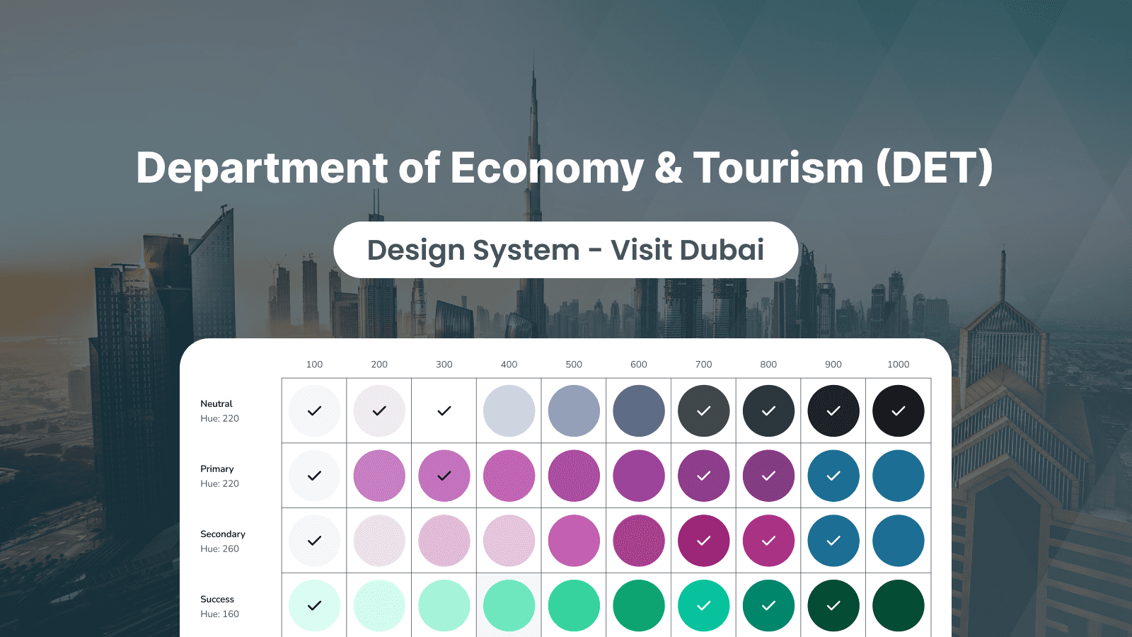
1. Tokens: These are the molecular values needed to build and maintain a design system. This comprises of:
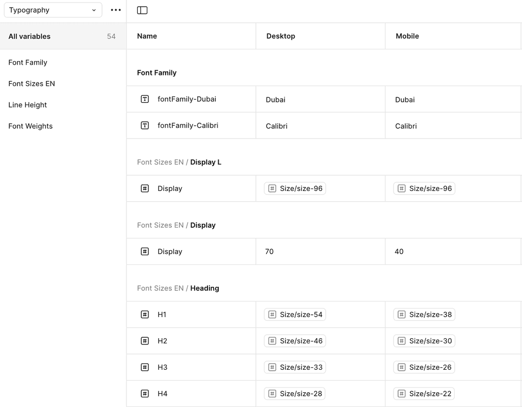
Text sizing is a fundamental aspect of typography that influences readability, visual hierarchy, and overall user experience. Choosing the right font size ensures that content is easy to consume while maintaining aesthetic appeal.
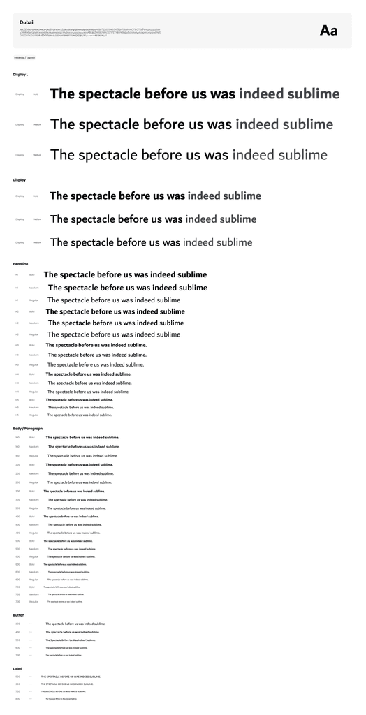
Figma's Typography Variables allow designers to create flexible, scalable, and consistent text styles across a design system. Instead of manually adjusting font properties, typography variables enable dynamic text adjustments for different themes, screen sizes, and accessibility needs.
Typography variables in Figma are reusable text properties that control various aspects of typography, such as:
Font family
Font weight
Font size
Line height
Letter spacing
Text decoration (underline, strikethrough, etc.)
Text case (uppercase, lowercase, etc.)
These variables help maintain consistency while allowing adjustments based on different contexts, such as light/dark themes or mobile/desktop views.
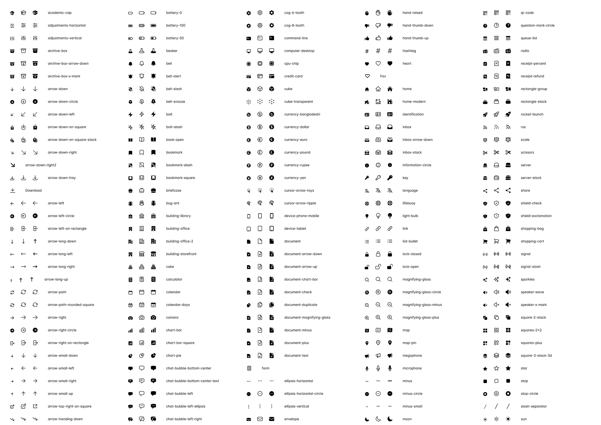
Icons serve multiple purposes within a digital interface, including:
Navigation – Representing menu items, links, or actions (e.g., home, settings, search).
Action Indicators – Communicating functions like edit, delete, share, or download.
Status & Feedback – Conveying system states such as success (✓), warning (!), or error (✖).
Brand Identity – Reinforcing a brand’s style through a consistent icon language.
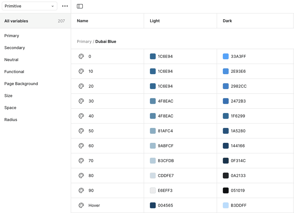
Colors
Color is a fundamental aspect of design that influences visual hierarchy, accessibility, and overall user experience. Choosing the right color system ensures consistency, enhances readability, and helps communicate brand identity effectively across different interfaces and themes.
Color Variables Control:
Primary – The main brand color used for key UI elements like buttons and links.
Secondary – A complementary color to the primary, used for accents or secondary actions.
Neutral – A range of grays used for text, borders, and subtle backgrounds.
Functional – Colors used for status indications like success (green), warning (yellow), and error (red).
Background – Colors used for the UI background, containers, and surfaces.
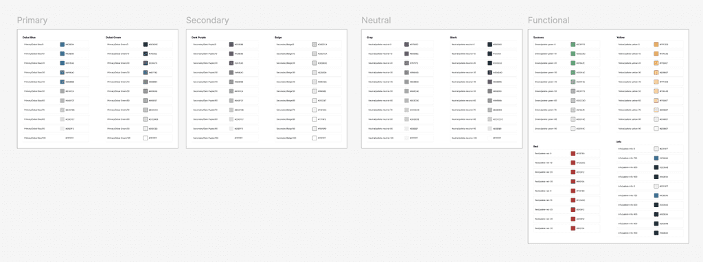
Themes: These are objects of certain shape that contain a set of design tokens, which collectively describe a particular visual language.
Color Modes
Figma’s Color Variables allow designers to manage colors efficiently, ensuring consistency, flexibility, and adaptability in design systems. With color variables, you can dynamically adjust UI elements for different themes (light/dark mode), states (hover, active), and accessibility needs.
Part 2
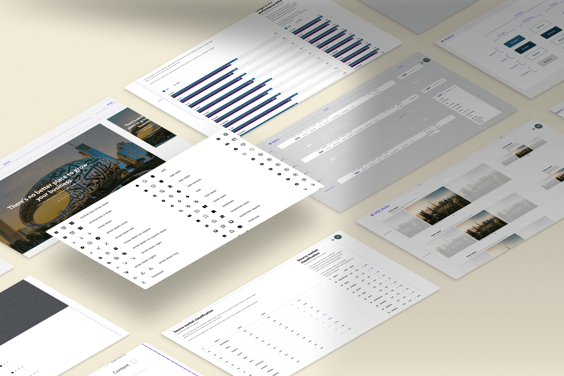
DLS components are reusable, predefined sets of Views/View Groups that can be used by applications according to their needs. These components can be either independent or compound. Independent components are basic elements of a complex layout (such as ImageView, Buttons, etc.), while compound components combine one or more independent components and tokens.
The components built using auto layout and optimized for dark & light modes.
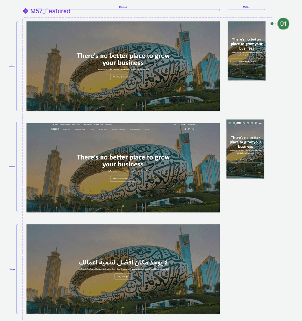
Hero
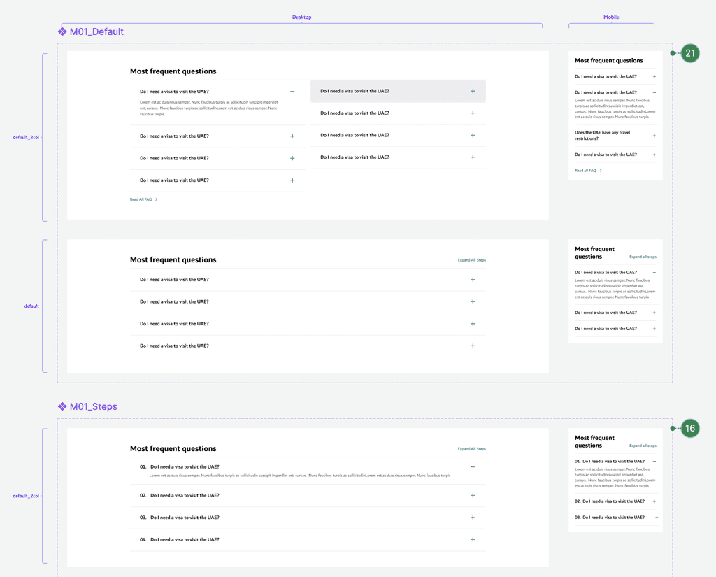
Accordian
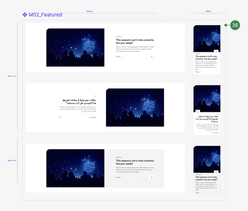
Article
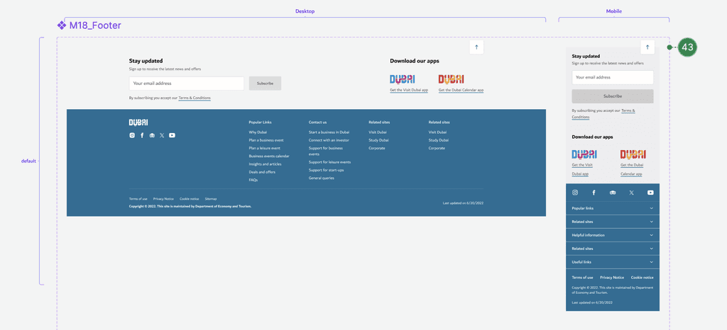
Footer
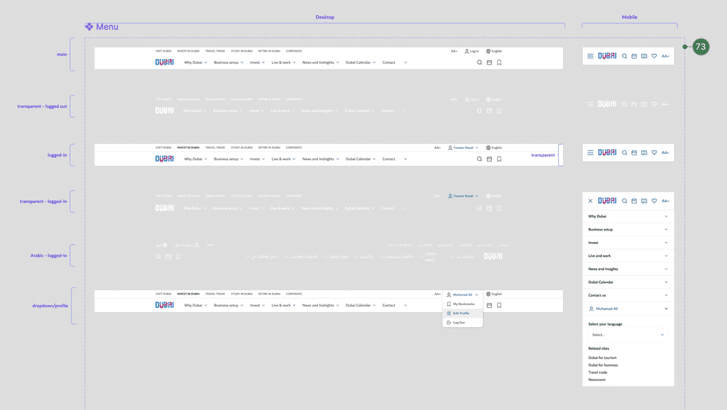
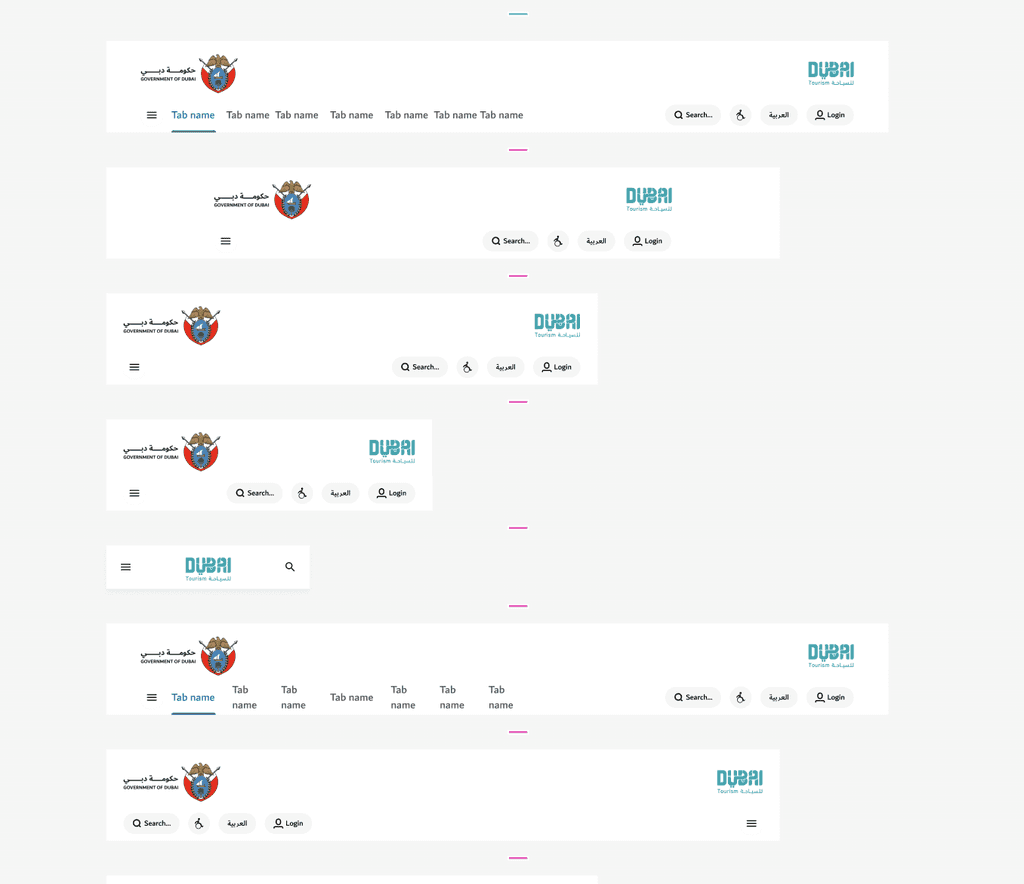
Menu
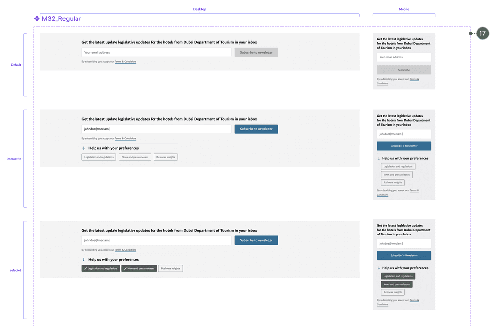
Newsletter Subscription
Impact
This design system migration from XD to Figma has transformed how Visit Dubai looks and feels, establishing it as one of the region’s most visited website (recorded approximately 1.64 million visits in 2024). Laying the foundations of Dubai DET’s design language has been a proud achievement, seeing it evolve and resonate with such a broad audience. Watching the entity grow and adapt has been inspiring, and it’s exciting to see how the team continues to build on this vision for future growth.
Key Learnings and takeaways
Consistency is Key
A design system ensures a unified look and feel across the product, improving user experience and brand trust.
Cross-Functional Collaboration is Essential
Building a successful system requires tight alignment between design, development, and product teams from the start.Documentation Drives Adoption
Clear, well-maintained documentation makes it easier for others to understand, use, and contribute to the system.Start Small, Scale Smart
Begin with core components and patterns—then expand based on real usage and team needs.Design Systems are Living Products
They need regular updates, feedback, and governance to stay relevant, useful, and scalable.
Takeaways
Start small and scale, don’t wait to build a “perfect” system before rolling it out.
Prioritize high-impact, high-usage components early on.
Set up version control and usage guidelines from day one.
Treat your design system like a product keep iterating.
Foster a culture of contribution and shared ownership.